We were given three subjects: Nature/Decay, A School Brochure and a photo essay, and we had to take, edit and present the photos of each subject.
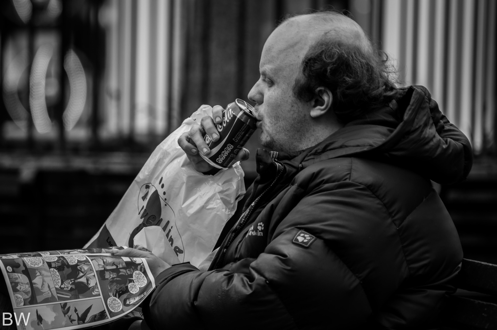
The nature photos I took were all landscapes, and two of them were panoramas that capture more of a scene than an individual frame. I wanted to take landscapes at they wit within the nature theme and I had a large number of landscapes that I had taken in the last couple of years that I could use for this subject. Since it was winter, the images that I used for the school brochure had a grim look straight out of the camera, so I decided to run with this idea and gave all of the images a dark look. using sledging as a subject for my photo essay was something of a spur of the moment thing, as we were not expecting snow on the weekend i planned to shoot. so a few friends and myself decided to go sledging, and use image we took for our photo essays. I wanted my images to convey the excitement, energy and movement of sledging.
My favorite parts of this project was Taking and editing the images as I have some experience in taking and editing photos, as it is one of my hobbies, so I had past experience with operating a camera and using image editing software (although I primarily use Lightroom as opposed to photoshop). The parts of the unit that I least enjoyed were the annotations and planning stages, simply because they were a lot of typing and writing, as opposed to being out shooting or editing images.
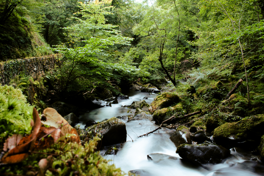
The top image is one of my personal favorite images that I took. I think it works well due to the combination of good lighting, nice composure and the blurring of the stream by setting a low shutter speed. The professional image below works for the same reasons.
The image at the top is probable my least favourite image of all of the images that I took over the course of the unit. This is due to the focus being slightly off, and the lack of contrast in the photo. The composition is also pretty uninteresting, and the image is too dark. The professional image below mine is similar, but works because of the better contrast and focus.
I improved my photography skills by reading magazines and online articles on photography, and watching instructional videos on the internet. I was lucky going into this unit as i already had some experience with photography. I improved my editing skills in much the same way, watching and reading instructional videos.
I chose flickr for my photo essay and nature photos, as it is a simple, clean looking way of presenting photos, and it is easy to embed a slideshow onto the blog. The only way to present the brochure was... in a brochure.
I created this using Adobe Photoshop.
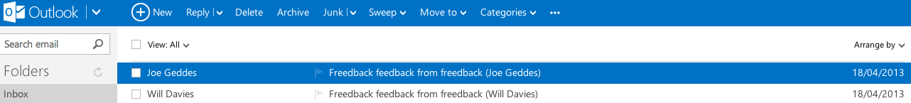
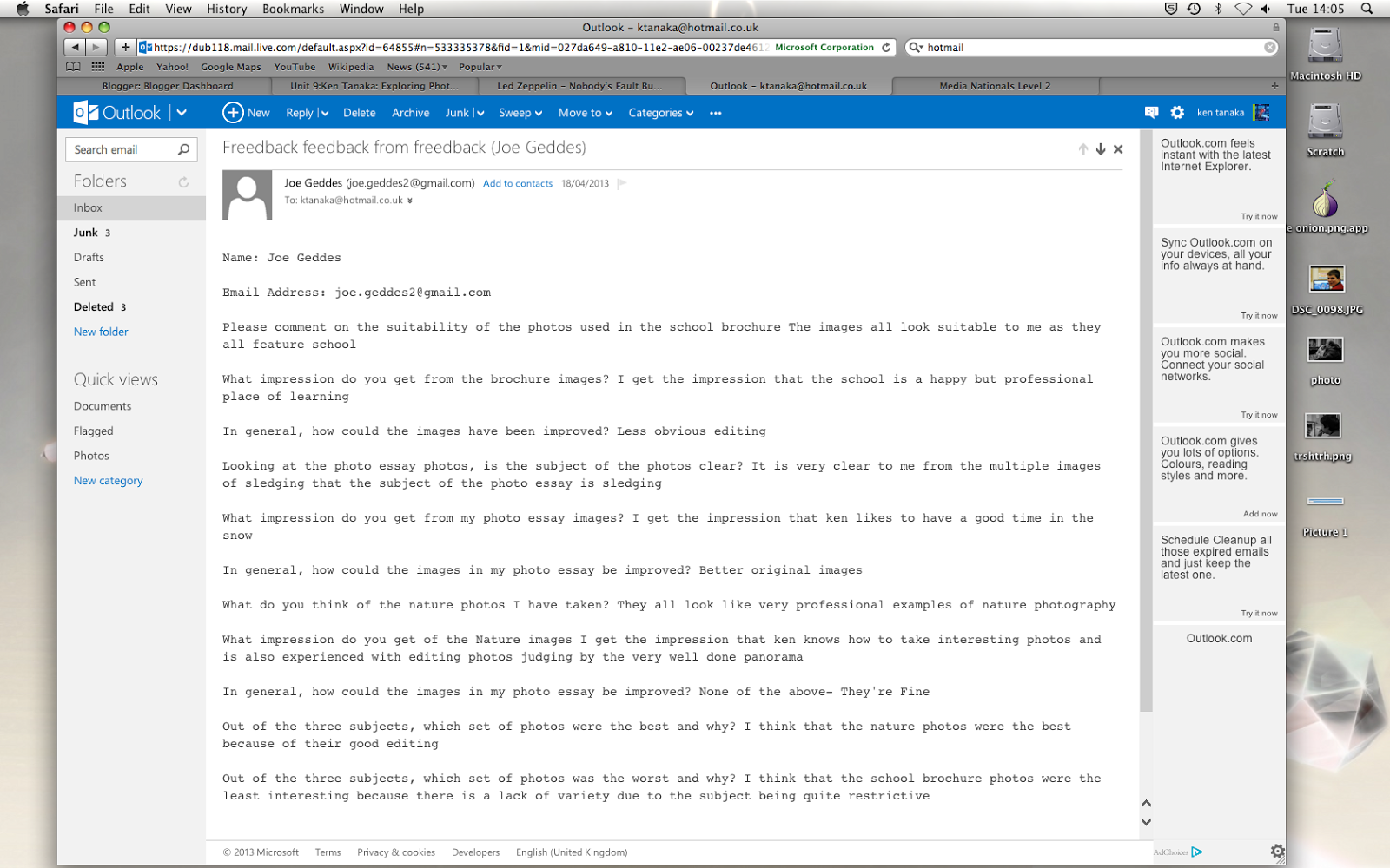
I got feedback from my images using a free online form called freedback. I created the form and then embedded it onto the blog. them, people could fill out and submit the form, and I would receive an e-mail that told me who had filled out the form.